
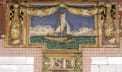
Franklin Street Station
A lot of Squire Vickers now mixed in with a little bit of Aretha...
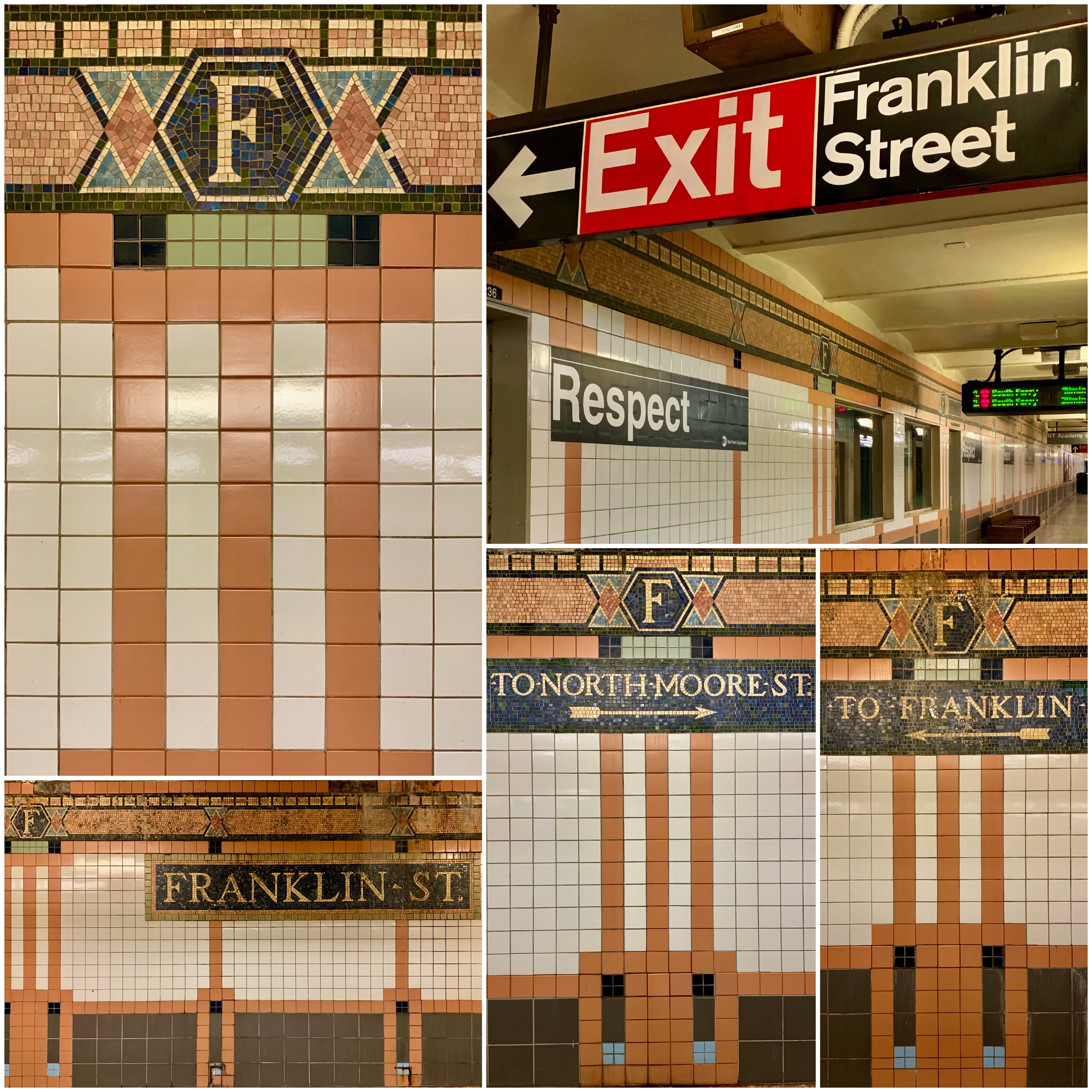
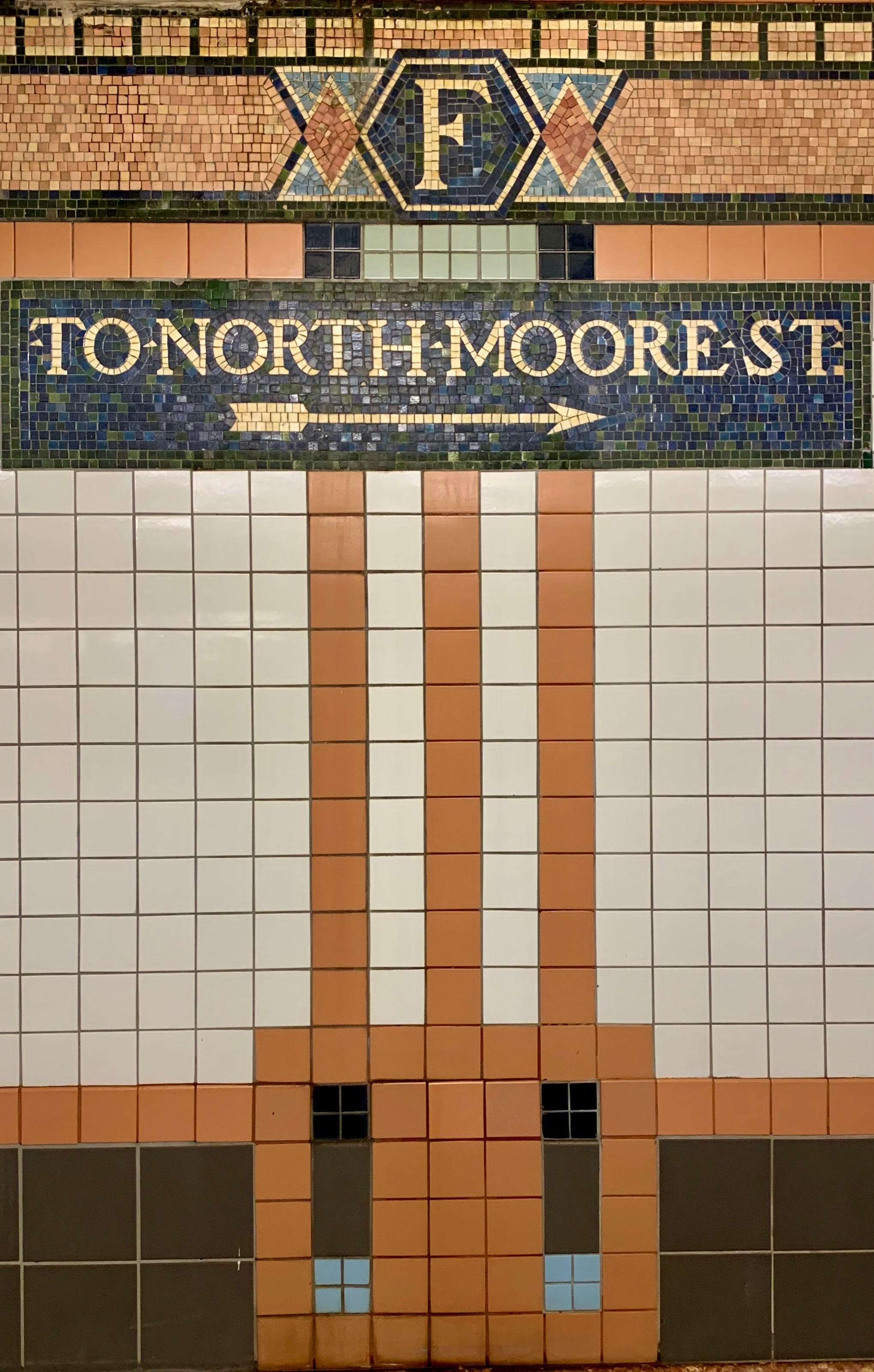
Dual Contracts stipulating the construction and operation of rapid transit lines in the City of New York were signed on 19 March 1913 and allowed the Interborough Rapid Transit Company (IRT) and Brooklyn Rapid Transit Company (BRT) to merge and expand. The IRT then agreed to add on to the original subway line south down Seventh Avenue, Varick Street, and West Broadway to serve the West Side of Manhattan. Franklin Street was deemed a necessary place for a subway stop. Now on the 1 line, Franklin Street uses “store-window"-style displays for all of Squire Vickers’ signature mosaics and mosaic directional tablets.
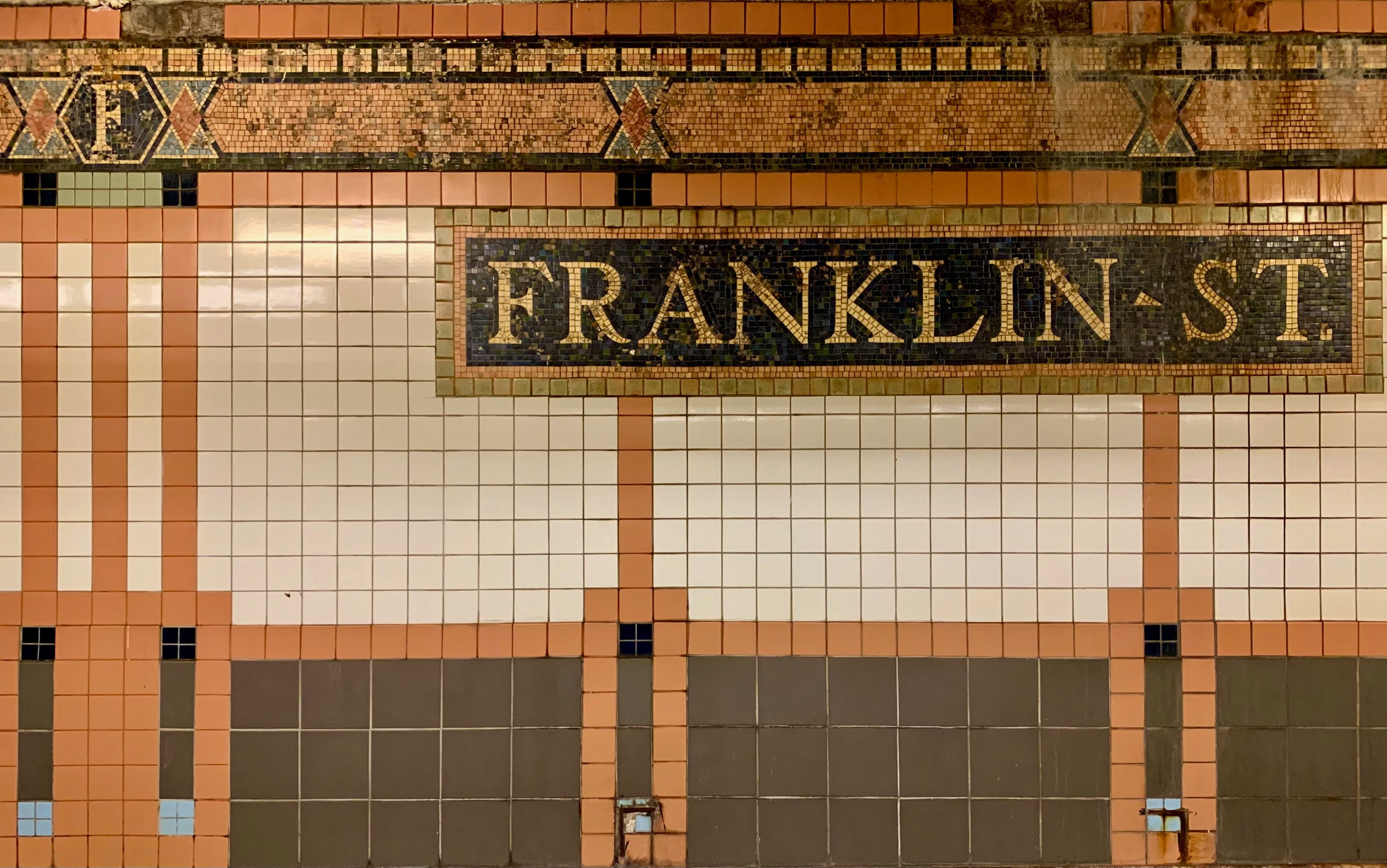
When he wasn’t masterminding the look of the growing underground transit system, Vickers passed the hours painting and writing Romantic poetry. Though he did not live in the city, he was a regular subway rider; his daily commute from a Rockland County town called Grand View-on-Hudson to Manhattan included jaunts on the train, ferry and subway. Vickers’ stations encompass two types: the Arts and Crafts style, which are less ornate — and easier to maintain — than their Beaux Arts predecessors. Gone were the three-dimensional bas reliefs and swirling flourishes, as curves gave way to straight lines and faiences to vividly colored mosaic tiles and geometric designs.
Over time, though, his style shifted. When the city decided to erect the Independent Subway System — better known as the IND — in 1932, Vickers adapted Machine Age design, a variant of Art Deco, Machine Age styles were more streamlined and bolder, evoking a feeling of modernity and precision. The station name tiles shifted to sans-serif fonts and solid colors and the stations used austere mosaic name tiles with sharp edges and bold colors — vibrant and lively, but straight-to-the-point and all business.
Vickers would have loved the mass reaction to Aretha Franklin’s death in August 2018. Makeshift tributes — a mix of wheat-pasted messages, spray chalk and graffiti — to the Queen of Soul automatically popped up at Franklin Street and Franklin Avenue in Brooklyn. But, just as it did to stem the tide of graffiti, the MTA stepped in to control the aesthetic. “We wanted to memorialize the outpouring of love from the community for Aretha Franklin and in consultation with local leaders we agreed that ‘respect’ was a beautiful tribute and worthy message,” then-MTA spokesperson Jon Weinstein told local news website Gothamist. The black-and-white signs, which have the official MTA logo on them, were put up on September 1st to coincide with Franklin's funeral.
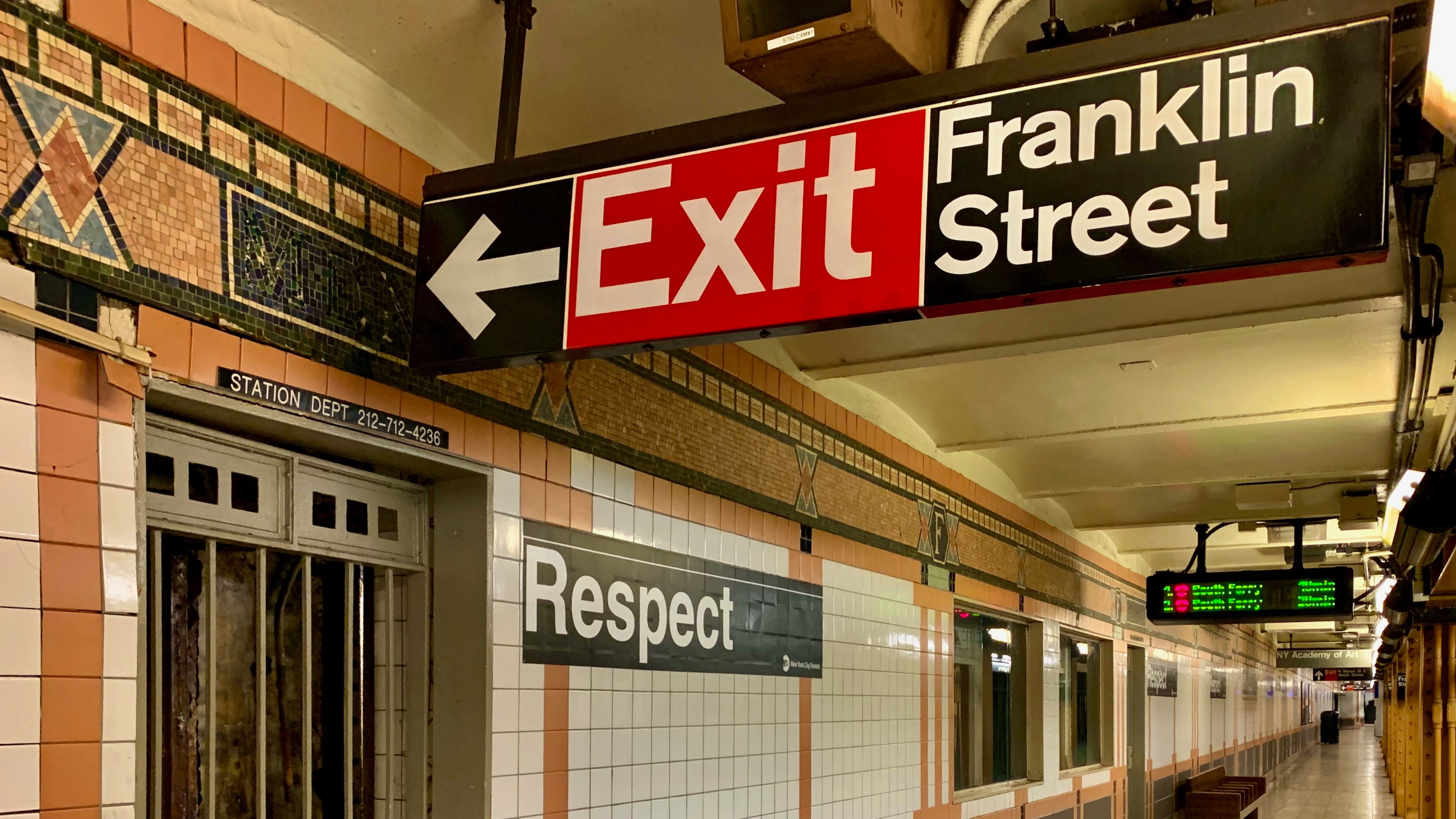
Brooklyn activist Leroy McCarthy put up the first Franklin tribute at Franklin Avenue in Brooklyn and brought the idea of a Franklin Street tribute to the MTA: “I saw the attention it was getting, so I reached out to MTA and asked if they would be open to a collaboration, suggesting a mural that said ‘Respect’ on the exterior wall,” McCarthy told a local paper, the Brooklyn Reader. “They came back instead with the idea of putting up ‘Respect’ throughout the station.” The MTA, of course, made sure that the Franklin signs matched all of its current branding.
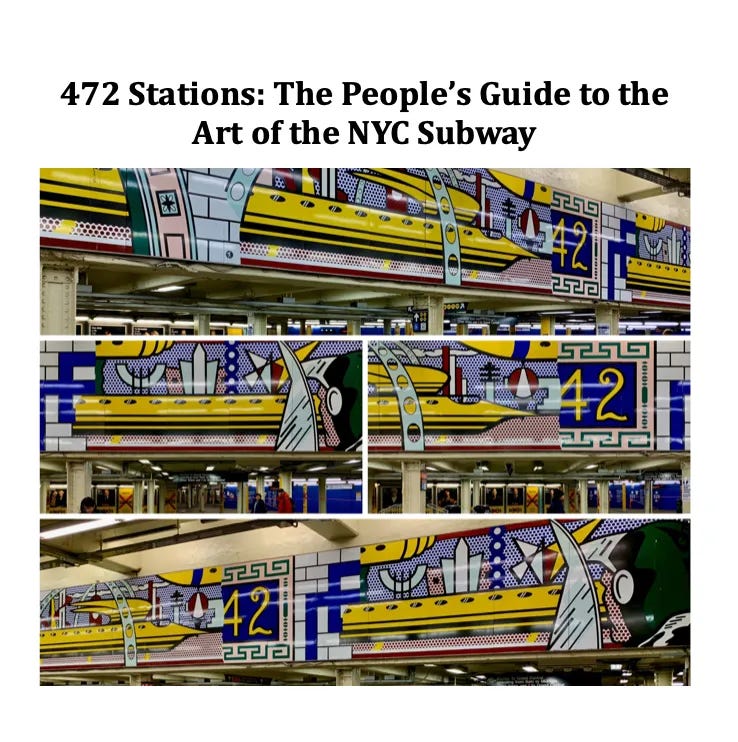
A Guide to the art of all 472 stations of the New York City subway:
From 2018 through 2021, I stopped off at 400+ stations of the New York City subway, took photographs of the public art there and researched the origin of the art, first for Instagram, then for Substack, for a 2023 Spectator article and now, hopefully, for a guidebook. A proof-of-concept book proposal 472 Stations: The People’s Guide to the Art of the New York City Subway is available.
Love the images and idea of RESPECT!
wonderful mosaics!